Address
304 North Cardinal
St. Dorchester Center, MA 02124
Work Hours
Monday to Friday: 7AM - 7PM
Weekend: 10AM - 5PM
Address
304 North Cardinal
St. Dorchester Center, MA 02124
Work Hours
Monday to Friday: 7AM - 7PM
Weekend: 10AM - 5PM
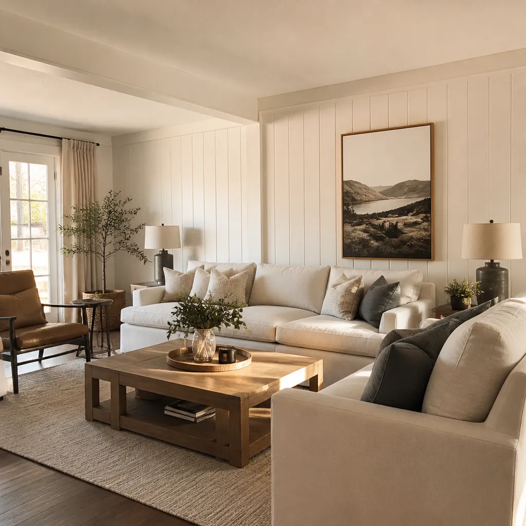
Wood paneling has a way of dividing a room. Some people love the warmth and texture it brings; others see it as a relic of a bygone era that makes a space feel dark, heavy, and stuck in time. If you fall into the second group, you’ve probably wondered whether the only real solution is to tear it all down. The good news? It doesn’t have to be. Paint is one of the most affordable, fastest, and most transformative tools you have for bringing outdated wood paneling into the present day.
This guide walks you through the best paint colors for outdated wood paneling walls, how to choose the right shade for your space, room-by-room recommendations, special finishing techniques, and the mistakes that trip people up along the way. By the end, you’ll have a clear plan for turning that dated wall into one of the best features in your home.
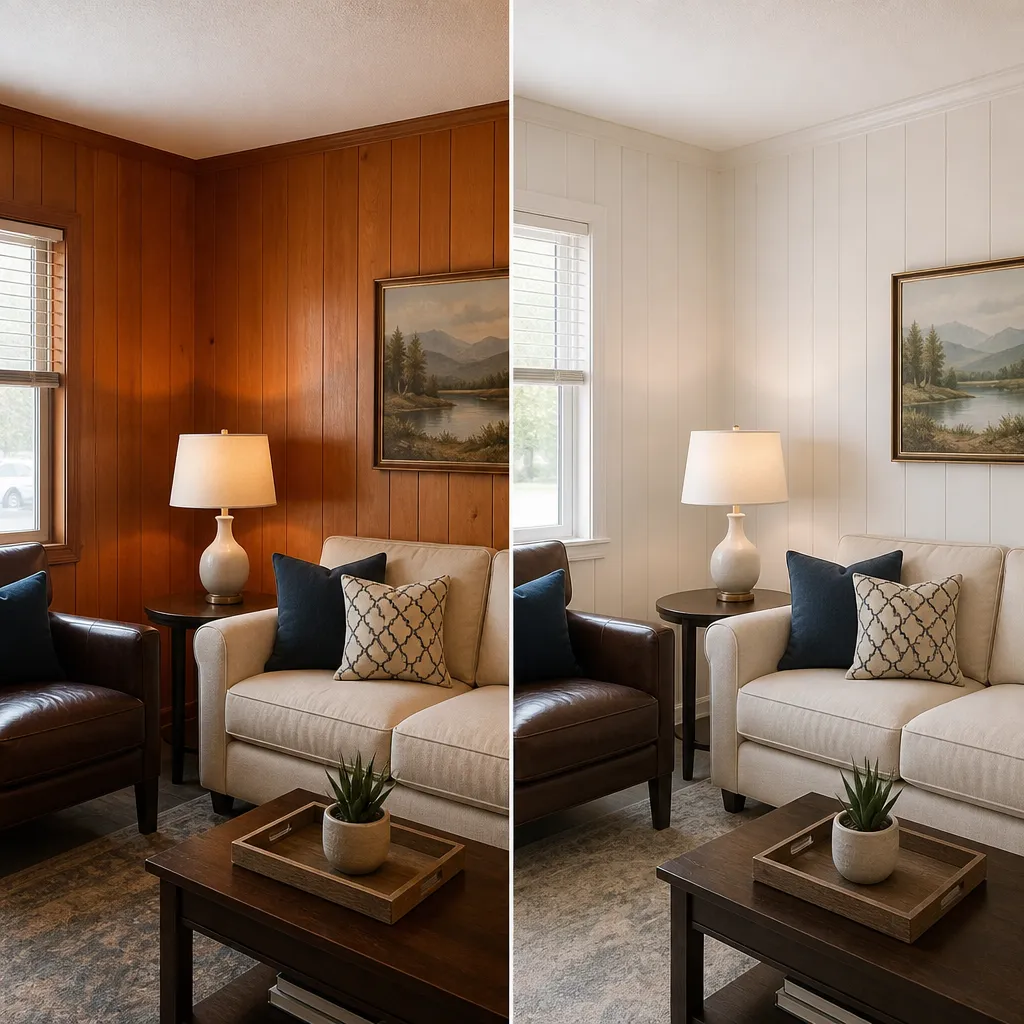
Before we dive into colors, it’s worth understanding why painting is such a smart move in the first place.
Ripping out wood paneling is expensive, messy, and time-consuming. You may discover damaged drywall behind it, need to patch and refinish walls, and pay for disposal. Painting, by comparison, costs a fraction of that. A few cans of primer and paint, some sanding supplies, and a weekend of your time can accomplish what a full removal and drywall job would take weeks to achieve. For homeowners on a budget or anyone renting who wants a dramatic change, painting is the clear winner.
Wood paneling—especially the dark, orange-toned varieties popular in the 1960s and 70s—absorbs light and makes rooms feel smaller and gloomier. A fresh coat of paint in a light or mid-tone color reflects light back into the room, making it feel larger, airier, and far more current. It’s one of the rare home improvements where the “after” is dramatically better than the “before” for very little money.
Here’s the thing: the texture of wood paneling isn’t the problem. The color is. Paneling adds visual interest, dimension, and a sense of coziness that flat drywall simply can’t match. Painting lets you keep all of that character while completely changing the mood of the room. You’re not erasing the paneling—you’re updating it.
Choosing a color isn’t just about what’s trendy. The specific paneling in your home, the light it receives, and the elements that won’t change all play a role in what will look best.
The underlying color of your wood paneling matters, even after you paint it, because the wood tone influences how the paint reads once applied (and because any visible knots or grain will interact with the color).
Natural light is the single biggest factor in how a paint color looks on your walls.
Your paint doesn’t exist in a vacuum. It has to live alongside things you’re not changing:
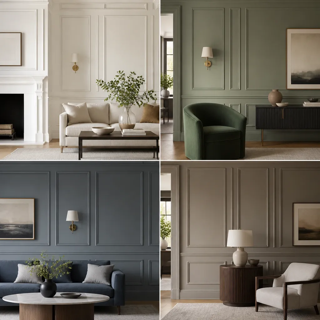
Now for the fun part. These four color families consistently work well over outdated paneling, and each brings a distinct personality to a room.
There’s a reason white is the most popular choice for painting over wood paneling. It brightens, enlarges, and creates a clean canvas that works with virtually any decor style. White also highlights the texture of the paneling in a subtle, elegant way.
Whites and creams are especially effective in small rooms, basements, and spaces where you want to maximize the sense of light and openness.
Green is having a moment, and for good reason. Earthy greens feel calm and grounded, and they complement natural wood tones beautifully. When applied over paneling, a soft green can make the texture feel intentional and organic rather than dated.
Soft greens work in nearly any room and pair well with both warm and cool accents.
Blues and grays are the go-to choices for a modern, sophisticated update. They cool down orange-toned paneling and add a sense of depth and polish.
Lighter blues and grays are also excellent for bedrooms and bathrooms where a more relaxed, airy feel is desired.
If you want timeless rather than trendy, warm neutrals are your friend. Beiges and greiges (gray-beiges) create a cozy, grounded atmosphere that feels both classic and current.
Warm neutrals are safe for resale, easy to decorate around, and forgiving of imperfections in the paneling surface.
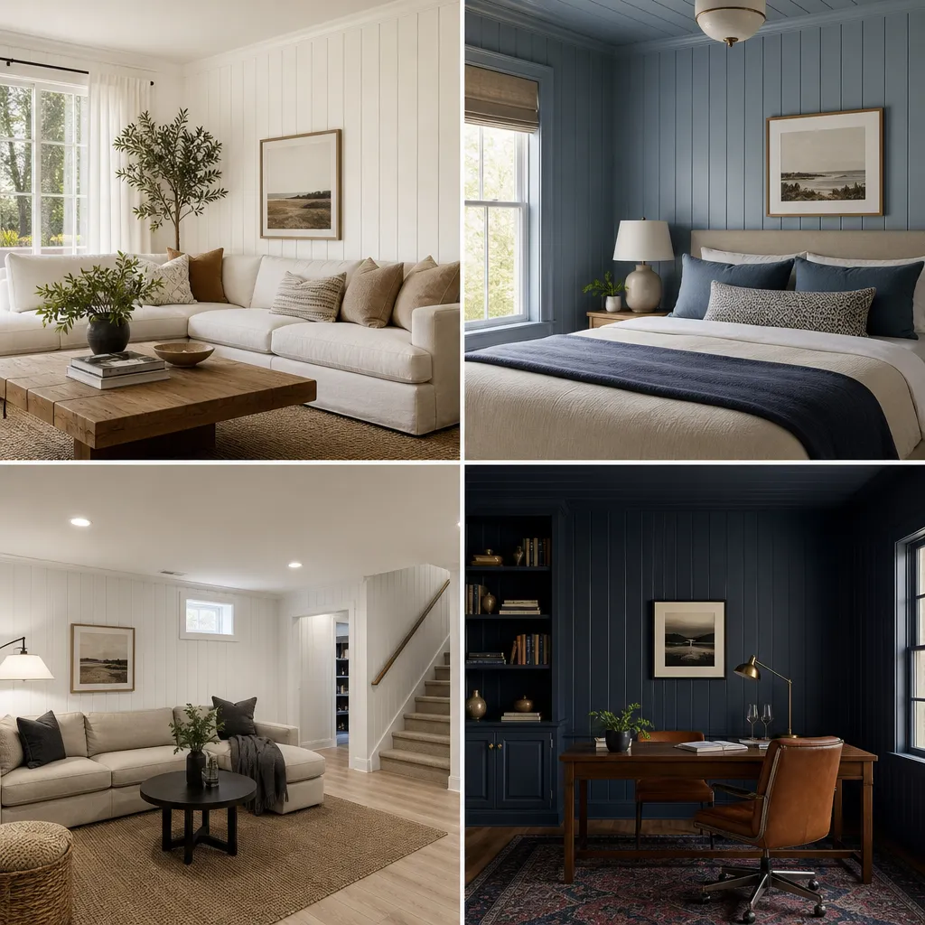
Different rooms serve different purposes, and your color choices should reflect that. Here’s how to approach each space.
The living room is often the largest and most-used space, so you want a color that feels inviting and airy. Creamy white or soft green are excellent choices. Creamy white opens up the room and lets furniture and art take center stage, while soft green adds warmth and a connection to nature. Both work well with a variety of design styles, from traditional to modern farmhouse.
Bedrooms should feel relaxing and restful. Muted blue or warm gray are ideal. These colors lower the visual “temperature” of the room and create a calming atmosphere conducive to sleep. Avoid overly bright or saturated colors in bedrooms unless you’re going for a specific design statement.
Basements are notoriously dark, so your goal here is to maximize light. Light, bright colors like pale yellow or white are your best bet. They counteract the lack of natural light and make the space feel less like a cave and more like a real living area. If your basement gets some light, a soft blue or green can also work well.
A home office should promote focus and feel professional. Deep navy or forest green are excellent choices. These colors are sophisticated, reduce visual clutter, and create a sense of seriousness that helps you get into work mode. They also look fantastic against wood paneling’s texture.
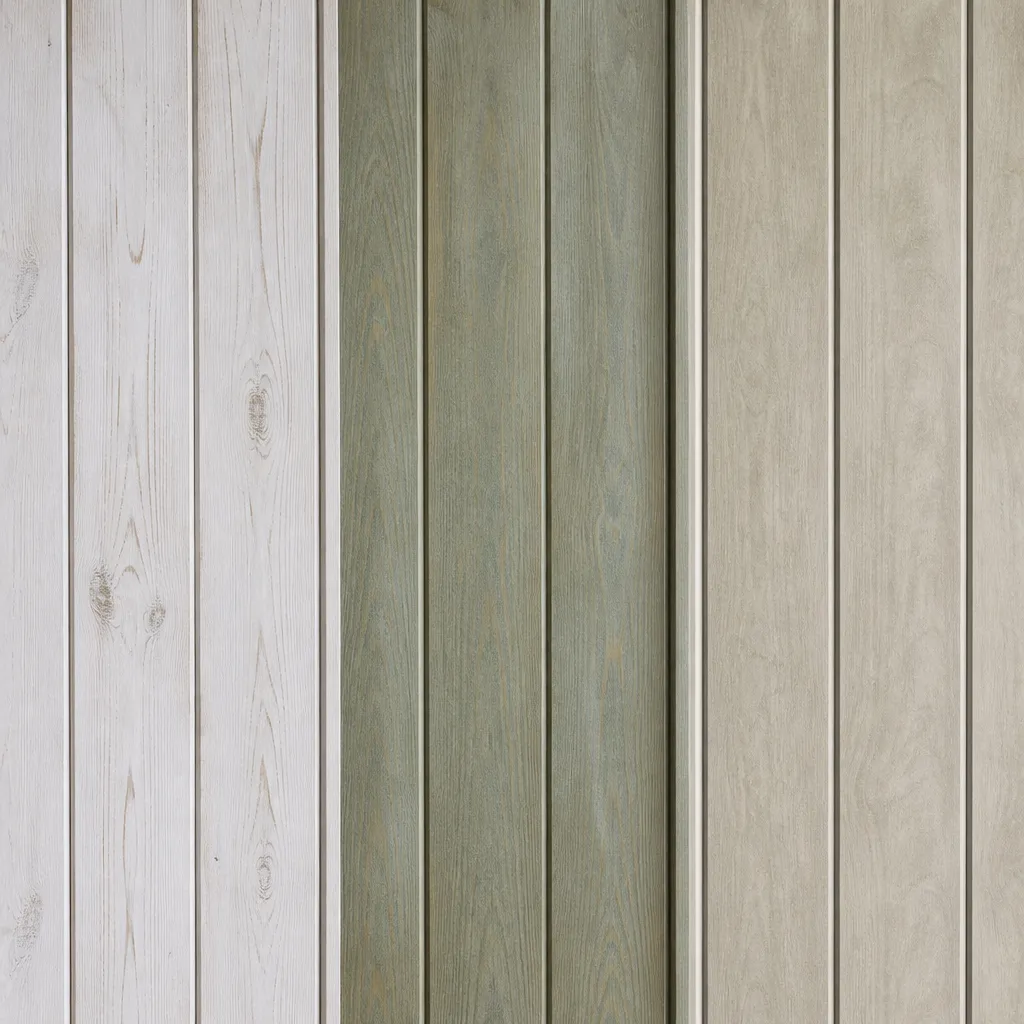
If you want something beyond a solid coat of paint, these techniques can give your paneling a unique, high-end look.
Whitewashing involves applying a thinned white paint or whitewash stain to the wood. It lightens the wood while allowing the grain and texture to show through, creating a rustic, beachy, or farmhouse feel. It’s a great option if you want to keep some of the wood’s natural character while dramatically lightening the space. The result is soft and organic rather than opaque.
Color washing uses a tinted glaze applied over a base coat (or over raw wood) to add depth and dimension. The glaze settles into the grooves and grain, highlighting the texture while adding a wash of color. This technique works well with greens, blues, and grays and can create a subtle, aged patina that looks custom and refined.
Limewash is a traditional finish made from crushed limestone that creates a chalky, matte, old-world look. It’s having a major resurgence in modern interiors because it adds texture and depth in a way that flat paint can’t. Applied over paneling, limewash modernizes the wall while giving it a soft, suede-like appearance. It’s especially beautiful in living rooms and bedrooms where you want a sense of history and warmth.
Never commit to a color based on a tiny paint chip or a photo on your phone. Wood paneling has texture, absorbs light differently than drywall, and interacts with its environment in ways you can’t predict. Here’s how to test properly:
This extra step takes a little patience but saves you from the headache of repainting an entire room because the color wasn’t what you expected.
Painting paneling isn’t difficult, but there are a few pitfalls that can ruin your results if you’re not careful.
This is the biggest mistake. Wood paneling—especially older paneling—often contains tannins that can bleed through paint, causing brown or yellow stains to appear. Primer also helps paint adhere properly, especially over varnished or glossy surfaces. Use a high-quality stain-blocking primer designed for wood, and don’t skip this step even if you’re using a paint-and-primer-in-one product.
The sheen you choose affects both durability and appearance:
Wood paneling has vertical grooves, and you have a decision to make: fill them or keep them.
Neither choice is wrong—just decide before you start painting so you can prep accordingly.
What is the best paint color for dark wood paneling?
Light and bright colors work best to counteract darkness. Creamy whites, soft grays, and pale greens reflect light and make the room feel larger. For a bold contrast, navy blue or charcoal can create a sophisticated, modern look.
Can I paint over varnished wood paneling?
Yes, but proper prep is crucial. Clean the surface, sand lightly to dull the finish, and use a high-quality bonding primer. This ensures paint adhesion and prevents peeling.
Should I fill the grooves in wood paneling before painting?
It’s a personal choice. Filling grooves with caulk or joint compound creates a smooth, drywall-like finish. Leaving them showcases the paneling’s texture, which can add character when painted.
What sheen is best for painted wood paneling?
Satin or eggshell finishes are ideal: they are durable, easy to clean, and provide a subtle sheen that highlights the texture. Flat or matte finishes can hide imperfections but are less washable.
How do I prevent wood tannins from bleeding through the paint?
Use a stain-blocking primer specifically designed for wood tannins, such as a shellac-based or oil-based primer. Apply two coats if necessary before painting.
What are the most popular paint colors for modernizing wood paneling in 2025?
Trending colors include creamy whites (e.g., Benjamin Moore Simply White), earthy greens (e.g., Sherwin-Williams Evergreen Fog), and rich blues (e.g., Benjamin Moore Hale Navy). These tones balance warmth and modernity.
Outdated wood paneling doesn’t have to be a dealbreaker. With the right paint color and a little prep work, it can become one of the most textured, character-rich features in your home. Whether you go with a bright, airy white, a calming green, a sophisticated navy, or a timeless greige, the key is to consider your wood tone, your lighting, and the elements you’re not changing—then test before you commit.
Painting is affordable, fast, and forgiving. Even if you change your mind later, you can always repaint. But with the guidance in this article, you’re well on your way to choosing a color you’ll love for years to come.